
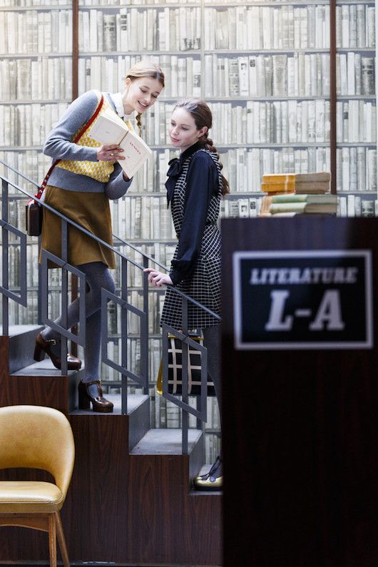
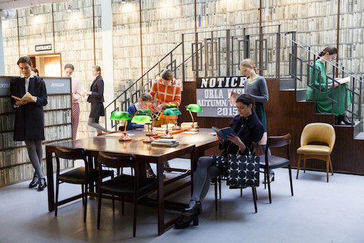
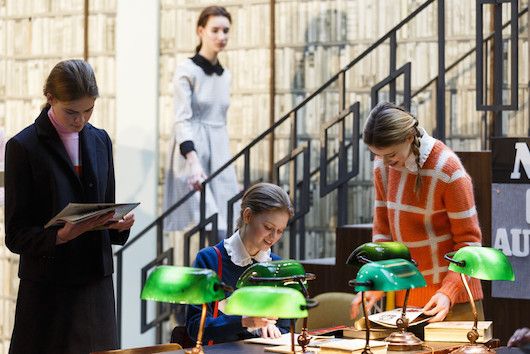
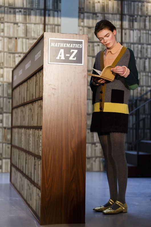
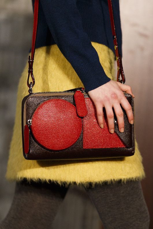

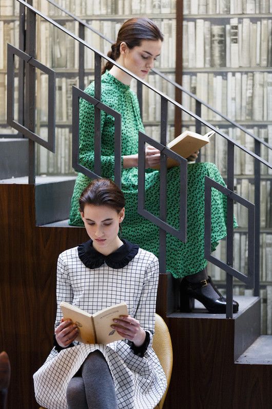
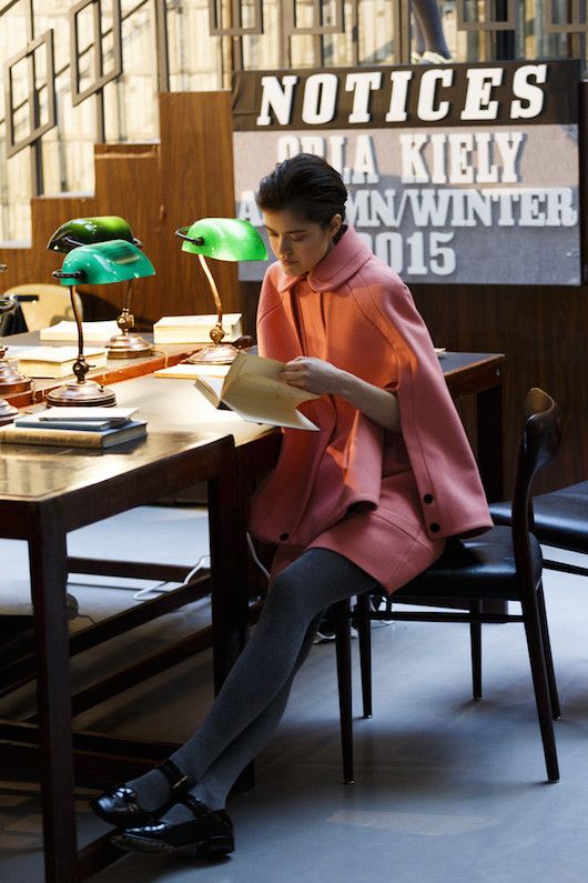
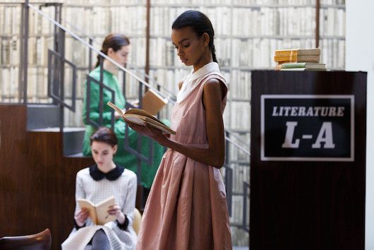
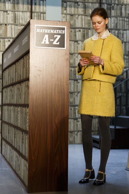
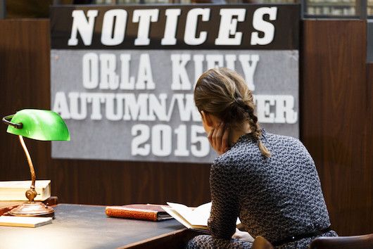
I'm usually a big fan of Orla Kiely's collections--the prints and classic shapes always fit my aesthetic. This season after browsing the shows at Style.com I was sort of disappointed by Orla Kiely; it didn't stand out to me like it usually does. I should have realized immediately that it was because the basic photography style of that site doesn't fit Orla Kiely's presentations. Their shots showed the clothes walking down a dimly lit runway; details were hard to see, everything looked a bit grim. A change in perspective and the whole collection looks entirely different. What first looked dull is revealed to be a library setting and the models didn't just walk down the runway and disappear into the recesses of the backstage, but rather presentation-style lounged around in the library, peering over books and scribbling notes. And in this setting I can appreciate the clothes; nerd chic will always appeal to me. More here.




CONVERSATION