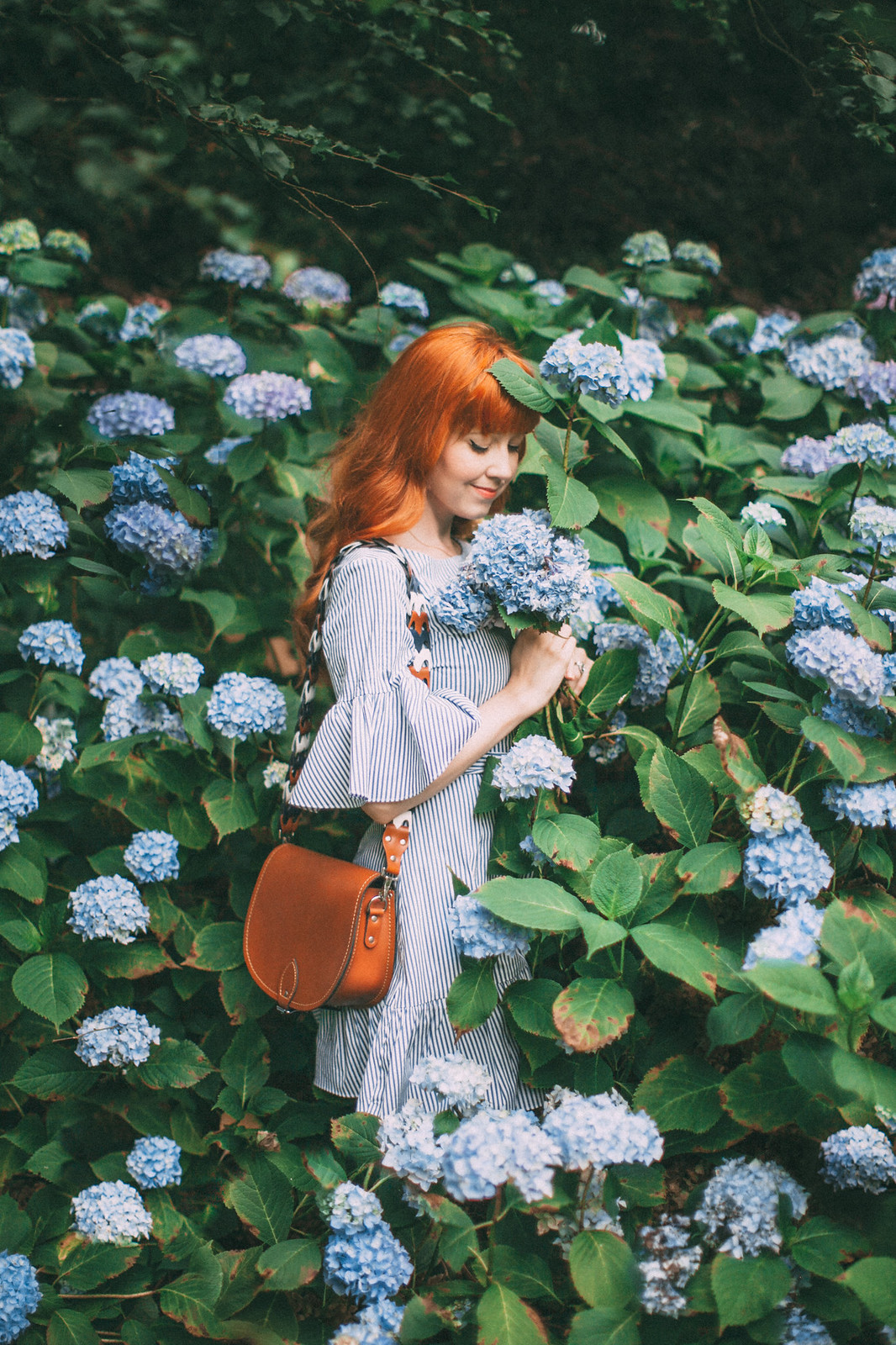
Long gone are the innocent days of blogging and Instagramming when you stuck up a post at 2am featuring whatever was in front of you or on your mind. Now it seems that posting good content on the 'gram isn't enough, said content must also look good collectively. There is a reason for this--people looking to discover someone new to follow stumble across one picture, if they like it enough they will click over to your profile and see the rest of your content presented as a whole. If the content looks very random or wildly varying in quality, they might not follow. However, if you chase one picture to a beautiful feed that is pleasing to the eye and seems full of intriguing content, you probably hit that follow button pretty quickly. Truth be told though, I feel quite strange writing this post about curating a cohesive feed because I don't think my feed is very cohesive especially in spring or summer (I like to think of it as coordinated)! I'm probably going to feel like a phony writing most of my blogging tips in this new series! However, I get asked these questions fairly often and I'm happy to share what works for me and what I've learned over the years.
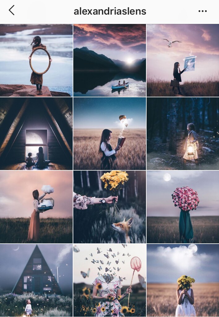 Develop a specific color scheme. The biggest way to unite your feed is through color; some people stick to a very strict color scheme that gives all of their photographs a distinct feel. When I think of someone with a distinct color story, alexandriaslens comes to mind. All of her photographs have a similar moody meets dreamy lighting and editing. Another thing I really appreciate about her feed and editing is that she does include lots of color; her posts feel united through a moody blue, but she also features pops of red and yellow. They key isn't always to get so focused on a set color scheme that you can't feature other colors, but rather to have a unifying style of editing that makes all of your photographs look like they belong together--like pages in a story. It definitely helps if you can stick to a strict color scheme in your wardrobe or photographs, but I think it's better to be able to play with color and still have a sense of cohesiveness without overly restricting yourself. If you want a unifying color scheme think about what color you want to emphasize and focus on in your photographs and desaturating or using other colors minimally.
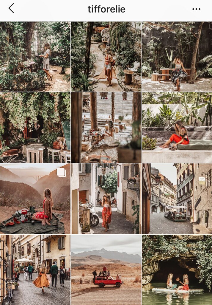 Cohesiveness is more than just color editing. A voice is ultimately what gives your Instagram a cohesive feel. It's how you tell a story and that comes from more than just what filters you like or how you edit, that also comes from the content you shoot. If you look at alexandriaslens's photographs, they feature: a centered, single subject in a clean, natural setting (with moody skies). Vastly different is tifforelie; her photographs also often feature a single, centered subject but the photographs are busy and the subject is much smaller in the scene. Whether she shoots in a city or in the wilderness, these are unifying elements along with color--her photographs tend to have a lot going on and a lot of things in focus. I really admire her ability to shoot in vastly different landscapes but still have an identifying feel to her photographs that you recognize her work no matter where or what she shoots. Part of being cohesive is having a style of photography and voice. Are your pictures consistently busy with small subjects, or simpler with bigger areas of focusing, or even a mix of both? Do you like being able to see everything in a shot, or to have the focus more fixed so the background is blurred and secondary? Figuring out your answers to those questions will help you create content that feels like it belongs together and has your distinct stamp to it.
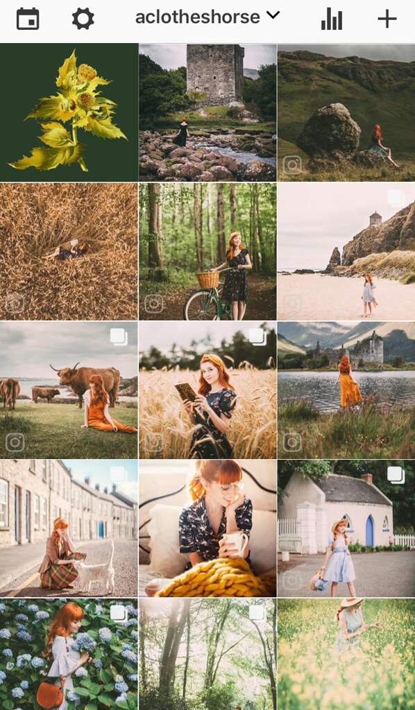 Plan in advance and look at your feed as a whole before you post. Ultimately whatever your strategy to keeping your content cohesive one thing that is really going to help you know whether a new photo works with your previous posts is being able to see your grid before you post. There are a few apps that will allow you to do this (you can do it AColorStory and VSCOcam), personally I use Preview. What I like about Preview is it syncs with my Instagram feed so I don't have to input pictures when I forget to plan in advance and can arrange and rearrange new unposted photos to my heart's content. Above is a screenshot of my current feed as seen through Preview; photos with the IG logo in the bottom corner are posts live on my feed and the first two photos are what I am planning on sharing next (with the first one covered by a flower box because *spoilers*). Again in the spirit of honesty, I usually only have 1-3 photos in advance at a time--I'm not a big planner when it comes to content! Anyway, I think seeing the feed in advance is the biggest "trick" to having a cohesive feed--by planning your feed and seeing what works and doesn't work before you post you really have a chance to keep your content concentrated or even help you transition between color schemes or seasons. I like to use the planning to balance photos, to keep me from posting too many photos from the same distance or with the same pose back-to-back. Instead I can see when things feel too repetitive and try to break them up so there's a sense of balance to the feed overall.
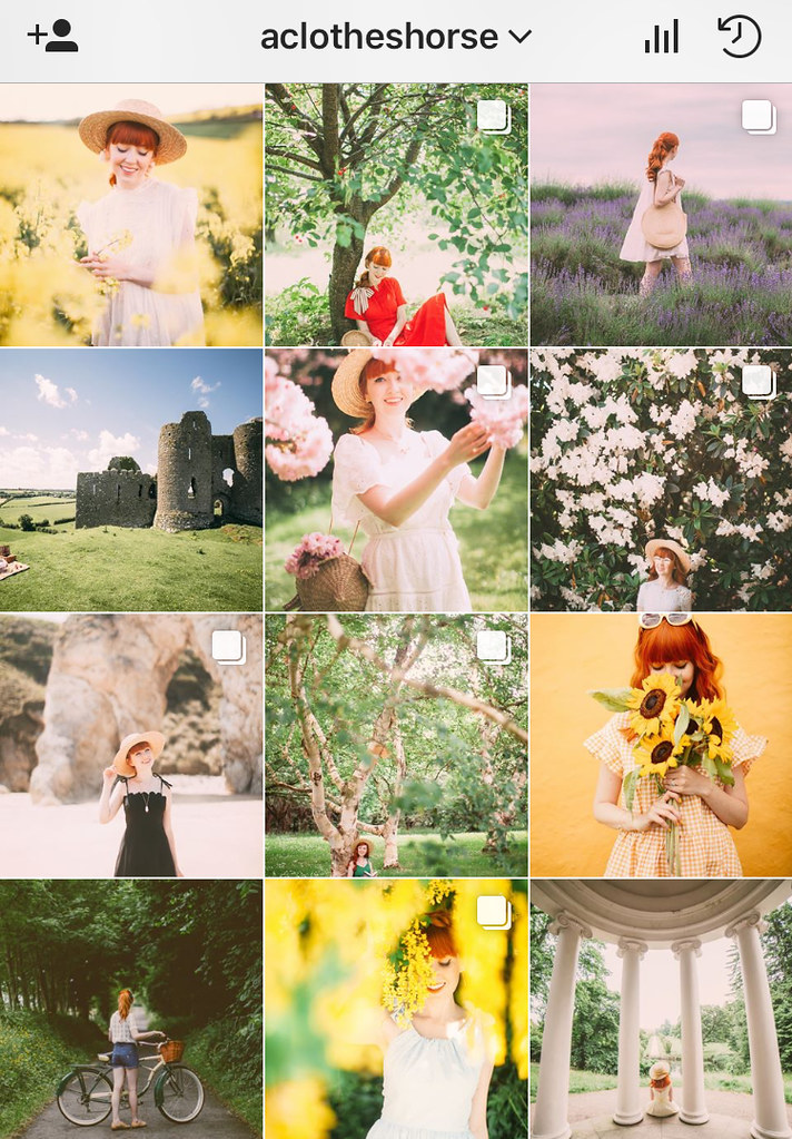 Try to transition and balance your content, instead of boxing yourself in. I sort of touch on this in the last point, but another way to be cohesive, or coordinated in the way I am, is not by adhering to a strict way of editing or specific color story, but trying to balance and transition your content. While I love cohesive themes personally I'm very inspired by nature with my photographs and that changes so much seasonally that my content can not look the same in winter as in spring (unless I seriously want to drown out that spring green, which I don't because I look forward so much to the new growth and color that comes in that season!). Even within seasons I love to explore different regions and a wildflower field will have very different colors to a manor house garden or an isolated castle. I also can't stop myself from wearing all of the colors--my closet is pretty much a rainbow. And sometimes I like photographs where I'm small in the image and it's more about the location and other times I post really tight photographs of my face! Instead of trying to force my photographs and outfits to fit a mold that feels awkward, I try to find unifying elements and to transition between posts, just as seasons themselves steadily transition. I make my editing slightly lighter and lighter as I head towards spring, slowly re-introducing green into the feed until it takes over! If I shoot a post mid-season that doesn't seem to "fit" with everything else, I try to find photographs with similar elements to "lead" into the new post so it won't stick out like a sore thumb. Above is my feed in a time where it's not perfectly cohesive or matched, but I like to think it still feels balanced.
Good content will always trump matching content. Ultimately though as much as a cohesive feed looks cool, the focus should be on stand-alone posts. Posting something just to transition or match seems like a waste if it doesn't tell a story or give anyone anything worthwhile to engage with. And if you have a great photo or moment you want to share, don't let the lack of matching your current content stop you from posting it!
 Develop a specific color scheme. The biggest way to unite your feed is through color; some people stick to a very strict color scheme that gives all of their photographs a distinct feel. When I think of someone with a distinct color story, alexandriaslens comes to mind. All of her photographs have a similar moody meets dreamy lighting and editing. Another thing I really appreciate about her feed and editing is that she does include lots of color; her posts feel united through a moody blue, but she also features pops of red and yellow. They key isn't always to get so focused on a set color scheme that you can't feature other colors, but rather to have a unifying style of editing that makes all of your photographs look like they belong together--like pages in a story. It definitely helps if you can stick to a strict color scheme in your wardrobe or photographs, but I think it's better to be able to play with color and still have a sense of cohesiveness without overly restricting yourself. If you want a unifying color scheme think about what color you want to emphasize and focus on in your photographs and desaturating or using other colors minimally.
 Cohesiveness is more than just color editing. A voice is ultimately what gives your Instagram a cohesive feel. It's how you tell a story and that comes from more than just what filters you like or how you edit, that also comes from the content you shoot. If you look at alexandriaslens's photographs, they feature: a centered, single subject in a clean, natural setting (with moody skies). Vastly different is tifforelie; her photographs also often feature a single, centered subject but the photographs are busy and the subject is much smaller in the scene. Whether she shoots in a city or in the wilderness, these are unifying elements along with color--her photographs tend to have a lot going on and a lot of things in focus. I really admire her ability to shoot in vastly different landscapes but still have an identifying feel to her photographs that you recognize her work no matter where or what she shoots. Part of being cohesive is having a style of photography and voice. Are your pictures consistently busy with small subjects, or simpler with bigger areas of focusing, or even a mix of both? Do you like being able to see everything in a shot, or to have the focus more fixed so the background is blurred and secondary? Figuring out your answers to those questions will help you create content that feels like it belongs together and has your distinct stamp to it.
 Plan in advance and look at your feed as a whole before you post. Ultimately whatever your strategy to keeping your content cohesive one thing that is really going to help you know whether a new photo works with your previous posts is being able to see your grid before you post. There are a few apps that will allow you to do this (you can do it AColorStory and VSCOcam), personally I use Preview. What I like about Preview is it syncs with my Instagram feed so I don't have to input pictures when I forget to plan in advance and can arrange and rearrange new unposted photos to my heart's content. Above is a screenshot of my current feed as seen through Preview; photos with the IG logo in the bottom corner are posts live on my feed and the first two photos are what I am planning on sharing next (with the first one covered by a flower box because *spoilers*). Again in the spirit of honesty, I usually only have 1-3 photos in advance at a time--I'm not a big planner when it comes to content! Anyway, I think seeing the feed in advance is the biggest "trick" to having a cohesive feed--by planning your feed and seeing what works and doesn't work before you post you really have a chance to keep your content concentrated or even help you transition between color schemes or seasons. I like to use the planning to balance photos, to keep me from posting too many photos from the same distance or with the same pose back-to-back. Instead I can see when things feel too repetitive and try to break them up so there's a sense of balance to the feed overall.
 Try to transition and balance your content, instead of boxing yourself in. I sort of touch on this in the last point, but another way to be cohesive, or coordinated in the way I am, is not by adhering to a strict way of editing or specific color story, but trying to balance and transition your content. While I love cohesive themes personally I'm very inspired by nature with my photographs and that changes so much seasonally that my content can not look the same in winter as in spring (unless I seriously want to drown out that spring green, which I don't because I look forward so much to the new growth and color that comes in that season!). Even within seasons I love to explore different regions and a wildflower field will have very different colors to a manor house garden or an isolated castle. I also can't stop myself from wearing all of the colors--my closet is pretty much a rainbow. And sometimes I like photographs where I'm small in the image and it's more about the location and other times I post really tight photographs of my face! Instead of trying to force my photographs and outfits to fit a mold that feels awkward, I try to find unifying elements and to transition between posts, just as seasons themselves steadily transition. I make my editing slightly lighter and lighter as I head towards spring, slowly re-introducing green into the feed until it takes over! If I shoot a post mid-season that doesn't seem to "fit" with everything else, I try to find photographs with similar elements to "lead" into the new post so it won't stick out like a sore thumb. Above is my feed in a time where it's not perfectly cohesive or matched, but I like to think it still feels balanced.
Good content will always trump matching content. Ultimately though as much as a cohesive feed looks cool, the focus should be on stand-alone posts. Posting something just to transition or match seems like a waste if it doesn't tell a story or give anyone anything worthwhile to engage with. And if you have a great photo or moment you want to share, don't let the lack of matching your current content stop you from posting it!



CONVERSATION